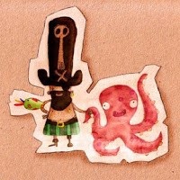
Waaaay back when I was still working at Yukfoo, I got the opportunity to dab into Production Design. Now, it was a longing of mine, and I was stoked when I was asked!
The studio started making the short film Preferably Blue back in like
So, with all my excitement and the precious help of Husband, we whipped up a proposal for the look in our spare time over a weekend:
(though those two are actually showing a later version of the bunny)
...with matching little tests in movement (sans bunny), to get a better feel, and also see that it was all in there (the proposed frames are renders, not paintovers) - they're on vimeo, click on the image and you should get there (plus a little bonus test on the look of a car):
A little later, I did some research concepts of different key moments of the film in a slightly different style. Not to change the look, but just because it was very fast and fun to only use the polygonal lasso and a fat custom square brush , which allowed me to block things out without worrying about details. (I guess because I am not that strong at speedpainting, I found a way around it):
My memory is fuzzy and I can't really remember when, but early on, possibly before we even did the tests, I provided the director with Production Design Notes. Actually not just for the director, but for everybody involved, so that we were all on the same page. I didn't know if that's how things were done, but I tried to look at blogs to try to find clues on production design (this post by Denise Blakely Fuller and the book Dream Worlds by Hans Bacher were my go-to references).
Said production design notes -slash proposal:
(all done in my spare time as well, otherwise it's cheating u_u)
Anywayyyyy... let's get to the characters a little. The final designs of the Bunny and Santa are by Alex, who provided me with the line and I did a pass over both to get a better feel:
I was never convived with the eyes of the rabbit , so I made a 10 minute sheet of expressions to prove my point that "dot" eyes could work (and I always wanted Santa to have black eyebrows à la Sean Connery, but that didn't make it):
I also did some colours variations to see what combinatoin suit/bunny colour would work best:
And then, once the bunny was all approved and modelled (by someone else), I took him to Zbrush to sculpt details in, then back to photoshop for another little pass, and voila:
While we are on characters, I did the same with the reeindeers. Below is the concept / paint over render after a zbrush pass of a reindeer (as a ref of what it should look like):
Then some more concepts for various sets and locations:
The color script that I never got to finish, mainly done in my spare time as well. I never fnished it because at around that time (we are now mid 2009), I left the company and moved down to Wellington. I did have a ton of things to finish before leaving, tie up some loose ends, finish some notes, so sadly the color script was one of the things that had to be left out. It's a shame, because I was really looking forward to that part of the process, and already had fun doing this first part:
After I left, I had to provide the studio with the opening frame of the film, based on an other artist artwork. I don't think I had much left in the tank at that stage:
And finally, (yes, rejoice, for this post is coming to an end at last) here are the Style guides that I provided the team with:
And if you are still there, as a bonus, some of notes / reference sheets that I gave them as well before leaving, so whatever I had started supervising could be handled without me:
I am not in love with the final result, but I left about a third into the whole production, so I can't really be too sad it is not what I had envisionned (and also, I was not the director, so really, it was never my vision anyway)...
Google the short if you want, it's somewhere out there.
I just wanted to get it all out there. It was good for me to do and in hindsight, I am happy to see that I did quite a bit of work. It's quite satisfying as well to see that between 2008 and now, there are a few projects that have used the paper look, and the little-built-sets look, and the vinyl-toys look. I must have been onto something a tad earlier than the trend. Always a nice hipster feeling =)


2 comments:
Wow! That's a lot of great work right there!
Thanks Christian!!
Post a Comment